Thursday, October 12, 2017

Boo Banner

Another Halloween banner and this one was almost embarrassingly quick and easy to make. Once again I used flags and twine from a banner kit I bought on post-Halloween clearance at Target last year. The triangular flags are super cute with their little Halloween pre-printed story and spider web and the top edge decorated with black microbeads. The kit also included a few plastic spiders so I attached one on top of the web on the center banner panel.

To save time and effort, I used black and ivory rosettes that I picked up on post-Christmas clearance at Target. (Did I mention that I love shopping post-holiday clearance sales at Target. Yeah, it's a bit of an addiction, but who can resist when you can use this stuff to make such cute decorations?) The black and ivory color on the rosettes coordinated perfectly with the banner flags, so all I needed were some letters and some die cut circles to make the rosettes pop even more. I used circle framelits to cut circles out of basic black card stock and glitter gold paper. I also used gold glitter paper and the Sizzix Phrase Boo w/ Frame die to cut out just the letters. Because the rosettes already add dimension, I just used regular adhesives to attach the letters to the rosetttes and the various layers to the banner flags and each other.

I love the way this short banner looks hanging on the door of our antique china cabinet. It's the perfect addition to our dining room Halloween decorations.


Wednesday, October 11, 2017

Halloween Banner

It's been a super busy month that didn't leave me with time for stamping until this week. With Halloween coming up, this themed banner took priority. It also happens to meet this week's Simon Says Stamp Monday Challenge Blog "Not A Card" challenge, so I will share it there.


The black banner flags and thick black and white baker's twine came from a kit I picked up last year at a post-Halloween clearance sale at Target. I love the alternating shapes and the glittered edges! (Starting with pre-made tags made the project easier, but event without the kit it wouldn't be too difficult to cut out the flag shapes from black card stock and glitter the edges using black glitter and sticky strip.)

I thought about using some of my Halloween patterned papers to make rosettes, but I wasn't in a mood to score, fold and hot glue, so I decided to go for a telescoping circle look using dimensionals. I cut out circles using the circles and starburst framelits, I used a retired SU designer paper for the largest circle, then silver glitter paper for the starburst on the next layer. The next circle was cut from black card stock and embossed using the Tim Holtz cracked embossing folder from Sizzix. The final circle layer was cut from pumpkin pie card stock and embossed with an SU spider web embossing folder.

I used chipboard letters from a retired Stampin' Up! assortment. I first used a black stampin' spot to dye them and then covered them with mono multi glue and fine black glitter. Once they were dry, I used mini glue dots to attach them to the pumpkin pie circles.

I like how festive and sparkly the banner turned out. It's the perfect window decoration in our living room.

For those curious, the backs of the lighted pumpkin trio in the transom window above the banner are decorated with retired SU Halloween décor elements.

Monday, September 18, 2017

Sparkly Halloween

I love Halloween and I love the pumpkin carving party my hubby and I have thrown every year since 1999. I also love making invitations for the party and I was super excited when I came up with this year's design. It's a fun mix of stamps, patterned paper and sparkly ribbon that is almost elegant but not stodgy, if that makes any sense. Because the ribbon is so shimmery, I'm sharing the card with this week's Simon Says Stamp Monday Blog Challenge: Shimmer and Shine and also with QKR Stampede Friday's anything goes challenge.

The springboard for the design was definitely the sparkly orange sequin wired ribbon I found at the Dollar Tree. I decided to pair it up with a piece of fun retired Halloween mosaic patterned paper. I adhered both next to each other to a 4" x 5x1/4" mat of basic black card stock. Even though the mat is covered up, I needed it to wrap and hide the edges of the ribbon and hemp twine. Using SU snail adhesive on the gold wired edges of the ribbon worked perfectly to adhere it to the mat.

I used memento tuxedo black ink to stamp the sentiment from the Halloween Bash set on more mustard card stock. I added a basic black mat, rounding the corners of both layers with the small corner rounder punch. I placed the sentiment where it straddled the ribbon and designer paper and attached it with 3M double sided tape. I find that tape is plenty strong to handle the different textures of the two surfaces.

I stamped the spider image from the Piece of Poison set on Really Rust card stock with versamark ink and heat embossed it with detail black embossing powder. Even though the embossing powder isn't metallic, it still helps the spider catch the light and shimmer a bit along with the ribbon. I punched the spider out with the large oval punch and added a basic black mat punched with the scalloped oval punch. I then punched a hole in near the spider's rear end with the 1/16" hope punch and threaded a piece of black hemp twine through, securing it in the back of the basic black scalloped oval with more 3M double sided tape which also served to attach the spider to the ribbon. I ran the hemp twine up and wrapped it around the mat to look like the spider's thread.  The last step was to attach the mat to the basic black card base with yet more 3M double sided tape.

I hope you and our party guests like this year's sparkly Halloween party invite as much as I enjoyed designing it.

Recipe:

Paper: basic black, more mustard, really rust, Creepy Crawly designer series paper
Ink: Memento Tuxedo Black, versamark
Stamps: Halloween Bash, Piece of Poison
Accessories: detail black embossing powder, large oval punch, scalloped oval punch, small corner rounder punch, black hemp twine, orange sequin wired ribbon by Greenbrier Inc.


Wednesday, September 13, 2017

Jolly Christmas Stocking

It's been a busy week; the kind of busy that doesn't leave a lot of time for stamping and even less for blogging. Still, I wasn't completely unproductive. I dug out some long-forgotten stuff out of my craft stash and cranked my big shot to make some cards for this year's Christmas stash. There was very little stamping on these as most of the work was done with die cutting and dry embossing, but I'm happy with how they turned out. I know the image shows only 1 card, but there are 9 more that are identical to this one with the super cute patterned envelopes and seals to go with them. I think they will make a good impact when they arrive in our families' mailboxes this Christmas season.

It all started with me digging out an invitation kit I bought on clearance years and years ago, back when I still had some weird ambitions to throw the kinds of Christmas parties that required mailed invitations. Needless to say, the parties never materialized so it was high time to find an alternate use for these supplies. Looking at the 8.5x 5.5" patterned invitation cards, I instantly thought of the SU Holiday Stocking die which (for reasons I still don't understand) is slightly too large to use on a standard A2 card but is actually the perfect size to use on this background. I trimmed 1/8" off all sides of the invitation and attached it in the center of a 8.5x5.5" white card base. I then got a good workout on the big shot cranking out 10 stockings in real red and 10 of the top, heel and toe stocking trims in whisper white, and them embossing all of them with the Snowburst, Petals-a-Plenty and Northern Flurries embossing folders. I take no credit for my choice of embossing folders - I totally CASEd Nendy Kerr's idea, which you can find in this post on her blog. I attached all the pieces of the stocking using 3m double sided tape, adding hanger loop at the top made from a strip of red card stock, and attached the completed stocking to the card.

I stamped the sentiment from the Tags 4 You set in real red on whisper white card stock and punched it out with the label bracket punch. To add a little interest and color, I attached a green galore card stock snowflake that I die cut with a thinlit from the Snowflake Card assortment to the back of the sentiment. For me, the easiest way to center the snowflake on the sentiment was to lay the sentiment upside down, add 3m double sided tape and then center the snowflake on top of the adhesive so that little bits of the shorter snowflake "arms" extended beyond the four corners between the "brackets" on the punched shape, as shown in the photo. I then added two more strips of double sided tape on top of the snowflake so that there was plenty adhesive to attach the snowflake/sentiment combo to the top of the stocking.

I like these cards because they are impactful without being too difficult or fussy to make, they're pretty flat for mailing, and also because they helped me clear out a little space in my craft stash. When you're a supply collector (or, as my husband would put it, probably more accurately, a hoarder) like me, you have to celebrate even these little victories :).

Recipe:

Paper: Whisper White, Real Red, Green Galore, Invitations from Holly and Berries invitation kit by Ampad
Ink: Real Red
Stamps: Tags 4 You
Accessories: Holiday Stockings Die, Snowburst, Petals-a-Plenty and Northern Flurries embossing folders, Label Bracket Punch, Snowflake Card Thinlits


Thursday, September 7, 2017

Plumber Thank You

hand made thank you card using the Guy Greetings and Plane and Simple sets from Stampin' Up!
I was in a race to make this card today. Unfortunately, my hubby discovered that one of our toilets was leaking so we needed a visit from the plumber, which was scheduled this morning. Fortunately, the plumber is a neighbor from down the block who is really cool and has a great sense of humor. As he was working, I decided that I wanted to make him a quick thank you card. I finished it, but just barely. He works fast!

I saved time by using Cathy's  really cool sketch from this week's splitcoast sketch challenge. It's a straightforward sketch which makes it perfect to make quick cards - I love it.

I embossed about half of the front of the kraft card base with the Measuring Tape embossing folder by Sizzix and added a piece of retired SU designer paper to the other half. (This scrap of designer paper is so old - it dates back to when SU sold single sided designer paper - wish I could remember what it was called). I found another scrap of retired SU designer paper for the center rectangular panel and mounted it on a mat of dusty Durango card stock before attaching both to the card front. I stamped the tools and saying form the Guy Greetings set on a scrap piece of manila folder in soft suede ink and die cut it with a framelit from the starburst assortment, attaching it to the card front with dimensionals. Finally, I stamped the sentiment form the Plane and Simple set on another scrap of manila folder and punched it out with the word window punch before mounting it on a mat made of a piece of not quite navy card stock punched with the modern label punch.

It's a pretty simple card but I think our neighbor will appreciate it, especially knowing it was made while he was working. I had fun making it and this was the best reason to make a card, even if I had to rush.

Recipe:

Paper: manila folder, dusty durango, not quite navy, SU retired designer papers, kraft card base from Neutral Smooth A2 cards and envelopes assortment by Darice
Ink: Soft Suede
Stamps: Guy Greetings, Plane and Simple
Accessories: Starburst Framelits assortment, word window punch, modern label punch, measuring tape embossing folder by Sizzix

Wednesday, September 6, 2017

Three Cupcakes

I made this card to satisfy a couple of challenges. The first was last Thursday's Ways To Use It 3s and Thirds challenge.  The second was Monday's technique challenge which was speedy cards fro good causes. At first glance this may not look like a speedy card, but really it took almost no time to put together.

I started with a chocolate chip base and a strip of retired SU designer paper (don't recall the name) that gave me the color pallet for the card. I stamped the cupcake image from the Little Layers Plus set and the sentiment from the For a Friend set  in chocolate chip ink on whisper white card stock. I colored both with markers in bashful blue, certainly celery, close to cocoa and daffodil delight. I punched the cupcake images out with the 1 1/4" square punch and punched three 1 3/8" square punch out of chocolate chip card stock. I added a 1/8" certainly celery mat to the sentiment.

I punched a 4 x 5 1/4" piece of bashful blue with the double rectangle punch and wove a piece of retired striped bashful blue ribbon through the holes. I added a chocolate chip strip mat to the designer paper and attached both to the bashful blue card stock beneath the ribbon. I attached the matted sentiment to the bottom corner of the bashful blue piece with regular adhesive and attached the matted cupcakes to the designer paper with dimensionals. That's it - no embossing, die cutting or fussy cutting, no complicated stamping techniques, and a pretty simple layout. A quick and easy card to put together that looks pretty impressive to those not in the know ;-).

True confession? These "old school" cards are sometimes my absolutely favorite. They may not be as gorgeous or artsy or sophisticated as the more complicated cards, but for me they're like grilled cheese and cream of tomato soup - warm and comforting.

Recipe:

Paper: whisper white, chocolate chip, bashful blue, certainly celery, retired SU designer paper
Ink: chocolate chip and markers in bashful blue, certainly celery, close to cocoa, delightful daffodil
Stamps: Little Layers Plus, For a Friend
Accessories: 1 1/4" and 1 3/8" square punches, double rectangle punch, retired SU striped bashful blue ribbon

Tuesday, September 5, 2017

Time to Bloom

Sorry it's been so long since my last post - the week got away from me and blended into a long weekend with too much going on to make it into the stamp room. I managed to make up for some of it today, but I'll post my creations one per day so I don't leave this blog hanging if I get busy again. I made this card to meet three challenges, though two of them are virtually the same so it's a bit of a cheat. The first challenge is from QKR Stampede, whose challenge this week was Wild West or Anything Goes. (As an aside, I'm thrilled to bits that my crazy cat yarn balls card got picked into the top 5 in QKR Stampede's challenge last week. It's a real honor and it will keep pushing me to stamp outside my comfort zone.)  Coincidentally, Go West was also the theme chosen for this week's splitcoast clean and simple card challenge. I took a somewhat unorthodox to the western theme by featuring blooming cactuses, and I stamped three of them to meet last weeks splitcoast's Ways to Use It challenge, which was all about 3s or thirds.

I started with a strip of whisper white card stock onto which I stamped three cactuses from the P.O Southwest Magna Stamp set from Clearbox using pear pizzazz ink and a wild wasabi marker with the thumping technique. I then used my stamp-a-ma-jig, melon mambo marker and a flower stamp from the Bella's Bloom set to stamp the large and small flowers. I used an aquapainter with crumb cake and soft suede inks to watercolor a sandy surface at the bottom and used the same technique with soft sky ink to create the sky.  I layered the whisper white strip onto a soft sky mat and distressed the soft sky layer edges with the SU distressing tool. I then added three pink gemstones to the centers of the large flowers for a bit of bling.

I used the wild wasabi and melon mambo markers to ink up the sentiment from the Bella's Bloom set and stamped it on a scrap of whisper white, which I die cut using framelit that coordinates with a Tim Holtz Sizzix coffee stamp set. The actual framelit is longer than I needed, so I simply moved the strip over and ran it through the big shot twice to get a shorter piece. I added a soft sky mat and freehanded the diagonal corners before distressing the soft sky edges.

Finally, I used the Wonderfully Worn background stamp and crumb cake ink to stamp the crumb cake card base. I then attached the image strip and the sentiment to the card base with dimensionals.

Recipe:

Paper: whisper white. soft sky, crumb cake
Ink: soft sky, crumb cake, soft suede, pear pizzazz, wild wasabi, melon mambo
Stamps: Bella's Bloom; Wonderfully Worn, P.O. Southwest Magna Stamp set from Clearbox
Accessories: Aquapainter, Stamp-a-ma-jig, distressing tool, Tim Holtz Coffee Time framelits by Sizzix, Multicolored Bling from Want2Scrap


Tuesday, August 29, 2017

Yarn Ball Anyone?

I've been thinking about making this card since last Friday, when I saw that this week's QKR Stampede challenge was Keep Your Eye On The Ball or Anything Goes. The challenge immediately had me thinking about a cat playing with balls of yarn. I didn't have time to stamp over the weekend and yesterday I got distracted by the National Bow Tie Day challenge, so I didn't get a chance to actually make the card until today. The good news is that waiting let me check out this week's color combo challenge on SCS and it was one that was (nearly) perfect. The colors were: soft suede, crumb cake, very vanilla and tranquil tide. I didn't have any tranquil tide so I substituted a piece of retired forest foliage card stock and a Bic permanent marker in For-Ever Green. I also used the sketch form last week's sketch challenge because why pile on another challenge, right? 

I started with a crumb cake card base which I stamped with the Sanded background stamp in crumb cake ink for some subtle texture. I added the strip of Forest Foliage card stock and a piece of twill tape. I stamped the basket and yarn images from the Basket Full of Fun set in Memento Tuxedo Black ink on very vanilla card stock and colored them with crumb cake marker for the basket and For-Ever Green marker for the yarn. I stamped the basket image again on a scrap piece of very vanilla card stock and fussy cut just the top of the basket and the two handles, coloring both with my soft suede marker. I glued the fussy cut piece over the matching image on the basket and punched two 1/16" holes where the handles met the top, decorating them with two bronze brads. I used my aquapainter and crumb cake and soft suede ink to wash a surface at the bottom of and around the basket. Finally I cut the card stock with a framelit from the circles assortment and cut a soft suede mat with a framelit from the Starburst assortment.

On a separate piece of very vanilla card stock I stamped the sentiment, cat, and several yarn balls from the cat chat set in Memento Tuxedo Black ink. I colored the cat using crumb cake and soft Suede ink and my blender pen. I colored the yarn balls with the For-Ever Green marker. I die cut the cat and yarn balls with the corresponding framelits and I used a framelit from the Everyday set to make the word balloon for the sentiment (I actually fussy cut the top of the word balloon because it was a little too big) and sponged the edges with crumb cake ink. I attached the cat and a couple of yarn balls to the stamped very vanilla circle with dimensionals. I cut off the circle at the side as dictated by the sketch and attached it to the card base over the other layers with dimensionals. As a final step, I colored a piece of white baker's twine with the For-Ever Green Bic marker and looped it around the front of the card to make it look like a meandering piece of yarn, attaching it with liquid glue.

I think the card turned out really well. I love the image of the cat getting caught with his paw in the yarn basket and still managing to casually ask "What's up?"

Recipe:

Paper: very vanilla, crumb cake, soft suede, forest foliage
Ink: Crumb cake, Memento tuxedo black. SU crumb cake and soft suede markers, For-Ever Green Bic permanent marker
Stamps: Basket Full of Fun, Sanded, Tim Holtz Cat Chat from Sizzix
Accessories: SU Circles and Starburst framelit assortments, Sizzix Everyday and Cat Chat framelits, Twill Tape, metallic basics mini circle brads by Making Memories, baker's twine, aquapainter, blender pen, stampin' sponge

Monday, August 28, 2017

Classic Grandpa

The Clean and Simple challenge today on SCS was to make a card with a bow in honor of National Bow Tie Day. I loved this challenge because it gave me a chance to use my bow tie die cut and embossing folder. I'm never quite sure of what does and does not fall within the parameters of clean and simple, and I worry that I may have gone a layer or brad too far for this card to fall within those parameters, but to me this is still pretty clean and simple.

I started with a basic gray card base and added a very vanilla mat that I embossed with the Darice Ties and Bow Ties embossing folder. I die cut a bow from a scrap of patterned paper and used basic gray ink to stencil the bow tie folds through the die that also serves as a stencil.  I used the same scrap as a mat for a strip of very vanilla card stock on which I stamped my sentiment from the Guy Greetings set in basic gray ink. A stamp-a-ma-jig was instrumental in helping me line up the different parts of the sentiment leaving space for the bowtie. I added three small circle brads at the bottom of this strip and sponged the edges with basic gray ink before attaching it to the patterned paper mat. I added another very vanilla layer and a basic gray layer before attaching the stack to the embossed very vanilla layer. As a final step I attached the bowtie die cut to the card front using dimensionals.

I think this will make a very snappy birthday card for a classic - and likely classy - grandpa.

Recipe:

Paper: very vanilla, basic gray, Patchwork Plaid by Colorbox
Ink: Basic Gray
Stamps: Guy Greetings
Accessories: Ties and Bow Ties Embossing Folder by Darice, Dear Old Dad Shapeabilities by Spellbinders. metallic basics mini circle brads by Making Memories, SMAJ, stampin' sponge

Friday, August 25, 2017

Back to Shool - part deux

Wednesday I couldn't resist making a card for the "Back to School" Simon Says Stamp Wednesday Blog Challenge, but I really don't have any use for a single card with this theme. I do, however, have a niece and nephew who are starting eighth and sixth grade, respectively, and those seem like perfect enough occasions to send cards even though I've basically ignored all their previous "back to school" occasions. Can you tell where this is going? Of course you can, and of course it leads right to me making another card.

My supplies from the first card were still out and I really like the color combination from this week's SCS color combination challenge, so I decided to use them for the second card as well. I like the way that makes the cards look like a coordinated set and I think the siblings will appreciate that as well.

Once again I used a Bermuda bay card base with a patterned paper mat. I dry embossed the patterned paper with the Print Blocks embossing folder and sanded it before attaching it to the base. I stamped the Dictionary background on a piece of whisper white card stock in Bermuda bay ink and applied the sentiment sticker over the background, coloring the notebook on the sticker with a gable green marker. I used an oval framelit to die cut the sentiment and used a larger oval framelit to die cut a mat from basic gray card stock. I attached them together and then attached them to the card base with dimensionals.

To create more interest on this card and to coordinate it better with the other, I added two strips of the gray arrow paper tape. I also used Bermuda bay and going gray markers to color the pencil image from the Elementary Essentials set and stamped it on whisper white. I fussy cut the image and attached it to the card with a dimensional at the eraser end and snail at the graphite tip. To finish the card off I added two green sequins and a bow made from the Parakeet verigated fancy floss, attaching all three to the card with mini glue dots. I know my niece will like the sequin "bling".

I love the way the cards turned out and how they look together. I think they will be the perfect encouragement for my niece and nephew for their first day of eighth grade and middle school.


Recipe:

Paper: bermuda bay, basic gray, whisper white, green patterned paper of unknown origin
Ink: bermuda bay, whisper white craft, basic gray, gable green
Stamps: Dictionary (background), Elementary Essentials
Accessories: sanding block, Ovals Framelits Assortment, Neutral arrow thin paper tape by K&Company, Print Blocks Textured Impressions Embossing Folder by Sizzix, velum sentiment sticker of unknown origin, Parakeet verigated fancy floss by We R Memory Keepers, Crafter's Corner green sequins from Greenbriar Inc.

Thursday, August 24, 2017

Rescued Best Wishes

Carla's Ways to Use Challenge on SCS today was for us to "rescue" cards we had in our stash that we weren't quite happy with and wanted to improve. This challenge is right up my alley, because as a hoarder I rarely throw stuff away, even the things I'm really not very happy with. I don't do this often enough, but on occasion I do dip into this "runt" pile and do my best to "rescue" one or two. It was an absolute pleasure to do so today for this challenge.

There were many rescue contenders in my runt pile, but my time was limited so I tackled on of the easiest ones. A little more than nine years ago (Wow - I can't believe so much time has passed) I was making single layer cards for an SU convention swap that used the masking and faux tearing techniques. You can find the card and the tutorial in this post.

The card was a bit complicated, so it's not surprising that not every single one of my efforts was successful. However, none of them were so bad that they deserved to get tossed, so I kept them all in my runt pile, including the one pictured here which, in all fairness, was nearly perfect. The frame image was not perfectly centered in the white space, but I could have lived with that flaw. What made me toss this card into the runt pile was the slight smidge of elegant eggplant to the left of the stamped frame. It's a small flaw, but I thought my swap recipients deserved better. And with today's additions, this scrap card turned into quite a usable one.

First I stamped the three cake image from the Fun and Fast Notes set in elegant eggplant ink on a square of glossy white card stock. I then colored portions of the image with markers from the wisteria wonder, old olive, and smoky slate blendabilities assortments. I attached the image to a larger square of elegant eggplant card stock with dimensionals. I die cut a strip of certainly celery card stock with the large scallop edgelit and then embossed it with the lace embossing folder from the Elegant Designs textured impressions set. I arranged the elegant eggplant and certainly celery elements on top of my "runt" card base and attached them with snail so that the lace overlapped the edge of the elegant eggplant square and also covered up the elegant eggplant smudge to the left of the sentiment. As a final touch I added three of the smallest pearls from the basic pearl jewels assortment to the center flowers on each cake and attached the next largest size of pearls in the semicircles of the embossed lace.

I think this was a rather successful rescue. I may like it even better than the last "rescue" I performed on a similar card base this spring. That particular "runt" was in worse shape and required more work to cover up its sins, but the final result was also pretty and elegant. .

Huge thanks to Carla for the great challenge. I have a feeling I will be dipping into my "runt" card pile again soon to perform some more rescues.

Recipe:

Paper: Glossy White, certainly celery, elegant eggplant
Ink: Elegant Eggplant, wisteria wonder, old olive, and smoky slate blendabilities assortments, and also certainly celery and lovely lilac on original card
Stamps: Fun and Fast Notes and also Floral, Sincere Salutations, and Frames with a Flourish on original card
Accessories: large scallop edgelit, Elegant Designs textured impressions embossing folders, Basic Pearl Jewels and also post-it notes, brayer, and Stamp-a-ma-jig on original card

Wednesday, August 23, 2017

Time to Hit the Books

The Simon Says Stamp Wednesday Blog Challenge this week is "Back to School". I don't have kids, so I don't normally make back to school stuff but recently, while rummaging through some really old scrapbooking supplies, I found some school related stickers, so I decided to play. And because one challenge is good but two are even better, I also decided to use this the awesome colors from this week's SCS color combination challenge - Basic Gray, Bermuda Bay and Lemon Lime Twist - or as close as I could get with my supplies.

I don't have anything in Lemon Lime Twist, but I found a piece of very vibrant green patterned paper in my scrap pile that Worked well with the other two colors. I embossed a 4x5.25" piece of the paper with the School Days embossing folder and used my sanding block to make the embossed areas more prominent. I then attached the mat to a bermuda bay card base.

For the tag, I cut a piece of basic gray card stock and a slightly smaller piece of whisper white card stock. I stamped the white card stock with the Off the Grid stamp in Bermuda bay ink, using the image a couple of times to cover most of the tag. I added the vellum sticker with the books and "hit the books" sentiment. I added the words "time to" by using the Stampin' Up! Alphabet Rotary stamp. I also colored the books and book ends with the gable green and basic gray markers.

I adhered the white card stock to the basic gay may and punched both with the tag topper punch. I added the basic gray hole protector which I created with the tag topper punch and the 1/2" circle punch. I cut several lengths of Parakeet verigated fancy floss and looped them thought the tag hole. I die cut a couple of arrows from the patterned paper and added them to the tag along with some gray arrow thin paper tape before attaching the tag to the card with dimensionals.

For the final element, I die cut a pocket watch shape using the Dear Old Dad Shapeabilities and Chalk Talk Framelits (I used the little oval for the hole in the top of the pocket watch). I embossed a piece of Bermuda bay card stock with the Clocks embossing folder and punched out a clock face with the 1 1/4" circle punch. I used whisper white craft ink to highlight the embossed areas on the face and attached the face to the pocket watch die cut. I attached the pocket watch to the tag with a dimensional.

I really like the way this non-traditional back to school card came out. Not bad for a stamp room that's really mostly devoid of any scholastic themed supplies :).

Recipe:

Paper: bermuda bay, basic gray, whisper white, green patterned paper of unknown origin
Ink: bermuda bay, whisper white craft, basic gray, gable green
Stamps: Off The Grid, Alphabet Rotary Stamp
Accessories: sanding block, Chalk Talk Framelits, 1/2" and 1 1/4" circle punches, tag topper punch, Neutral arrow thin paper tape by K&Company, School Days and Clocks Textured Impressions Embossing Folders by Sizzix, velum sentiment sticker of unknown origin, Dear Old Dad Shapeabilities by Spellbinders, Every Dray Framelits by Echo Park from Sizzix, Parakeet verigated fancy floss by We R Memory Keepers

Monday, August 21, 2017

Sweet Popsicle Birthday

In the Clean and Simple challenge today on SCS Tricia asked us to make a sweet birthday card. Although my usual style is not exactly clean and simple, when I saw this challenge I had an idea so I decided to go for it and I actually love the way it turned out.

I started by die cutting a piece of whisper whit card stock with the Ornate Card #2 Extra Long Bigz Die from Sizzix. Because I planned to use a portrait orientation, I used my paper cutter to trim the semicircle on the non-fold side so that the card could stand (which also made it completely symmetrical.) I then ran the card though my Big Shot with the Note Card Center Simple Impressions Embossing Folder from Sizzix, which gave me a raised rectangle in the center of the card for my image and sentiment.

I thought a popsicle would be perfect for a sweet summer birthday card, but instead of a single "flavor" I wanted a "swirled" popsicle. I inked up the popsicle image from the Mouthwatering set with the calypso coral ink pad and inked up the Baroque Border stampin' wheel with melon mambo ink. I then used the faux shaving cream to create my "swirled flavor" look by wheeling the melon mambo ink onto the popsicle image, making sure to twist my wheel occasionally to create the marbled look. I stamped the image on whisper white and fussy cut just the top of the popsicle.

I broke a real popsicle stick in half and attached it to the card with mini glue dots. I attached the popsicle image to the stick with more mini glue dots. I then used calypso coral and melon mambo markers to color the sentiment from the Cycle Celebration set and stamped it on whisper white before punching it out with the large oval punch. I attached the sentiment to the card with dimensionals. The card still seemed a little too plain to me, so I added strips of gold paper tape along both sides of the main panel. That little bit of "flash" was enough to let me stop.

Since the card base is die cut, I will be posting this card to the QKR Stampede Shaped Cards or Anything Goes challenge. What a fantastic challenge that is - it really got me to try some things that I wouldn't have thought of myself. If you have a little time, try making a shaped card of your own. Sometimes it's good to think outside a rectangle or square.

Recipe:

Paper: whisper white
Ink: Calypso Coral, Melon Mambo
Stamps: Mouthwatering, Cycle Celebration, Baroque Border wheel
Accessories: popsicle stick, Ornate Card #2 Extra Long Bigz Die from Sizzix,  Note Card Center Simple Impressions Embossing Folder from Sizzix, Large Oval Punch, Neutral Arrow Thin Paper Tape from K&Company


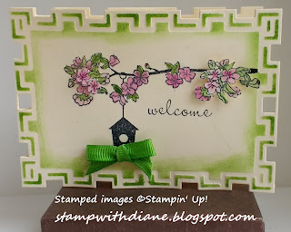
Tile Works Welcome

Friday's QKR Stampede Challenge was Shaped Cards or Anything Goes. I don't usually make shaped cards, but as it happened I attended the Stamp & Scrap expo Friday and picked up the Tile Works Spellbinders Nestabilities that were perfect for this challenge so I decided to play. I used the 2nd largest size die to make a card that would work well as a welcome to the neighborhood gift tag.

I had some pieces of plain office manila file folders left over from another project, so I used one to for the card. Before I removed the cut tag, I used the die as a stencil to sponge gumball green ink over the embossed portions around the card edges.

Originally I was going to make this a typical multi-layered card, but once I took it out of the die I realized that the combination of die cutting, stenciling and embossing was pretty interesting and the card didn't need layers. I stamped the main image from the Up In The Air set in Memento Tuxedo Black ink in the center. I colored the leaves and flowers using an aquapainter and gumball green and purely pomegranate inks (in retrospect, the aquapaintr might have added too much water and a blender pen may have been a better tool for this.) I didn't like the way the branch just floated in the center of the card, so I extended it to the edge using my basic black marker and then stamped  and colored the image again on another piece of the same manila folder scrap. I fussy cut two bunches of flowers from the scrap piece and attached them to the card with dimensionals. I used the larger bunch to cover most of the branch extension, so that it wouldn't be so obvious that it was hand drawn, and added the smaller bunch over the large bunch on the original image for balance.

The tag was fine, but I thought it still needed something. I remembered that Jeanne's Friday's Free For All challenge on SCS was to "put a bow on it" and that seemed like the perfect embellishment, so I grabbed a fork and made a small bow using a piece of long retired narrow green Stampin' Up! grosgrain ribbon. I attached the bow with a mini glue dot at the bottom of the bird house to finish off the card. I liked that he raised elements formed a triangle that drew the eye to the birdhouse and sentiment in the center of the card. It's a simple card, but it's still cute and would go very well with a gift to welcome a new neighbor.

Recipe:

Paper: manila file folder
Ink: Memento Tuxedo Black, Gumball Green, Purely Pomegranate, Basic Black marker
Stamps: Up In The Air
Accessories: Aquapainter, Green Narrow Grosgrain Ribbon, Spellbinders Nestabilities Tile Works Assortment

Saturday, August 19, 2017

Musical themed note

The QKR stampede challenge last Friday was Anything Goes with a twist: Inspired by Music. When I saw the challenge I instantly thought of all the music related embossing folders and punch that I've owned for a while but never actually used. This challenge was a good reason to bring them out and play! Unfortunately, my hubby and I left for a road trip before I had a chance to upload the card and it was too late when we came back, but I still thought I'd share it here and on SCS.

I started with a basic black card base. Then I cut a mat of whisper white and ran it through the big shot with the Piano Notes embossing folder from Darice. I've never tried to color the embossed part of an image with an ink pad because I worried that I would get ink on the non-raised portion. Turns out that was a legitimate worry. Even when using a basic black stampin' spot, it took me several tries to get  a black and white image that did not "muddy" up the white. Even that was not completely perfect (you can notice some balck ink "dirt" on the white piano keys") and it also wasn't dark enough, necessitating me to go over certain spots with my basic black marker. Imperfect though it may be, it still looks pretty good.

Next I used a Sizzix Simple Impressions Treble Clef embossing folder on whisper white to get that image, and colored the clef with a basic black marker. I added a stamped sentiment from the Mini Mates set in basic black ink and also some notes I punched out of basic black card stock with an eighth note punch from EK Success. I added a mat in basic black with room on the right side to punch holes with the double rectangle punch. I then wove a piece of narrow white grosgrain ribbon through the punched holes. I added a basic gray mat and attached the image to the embossed background with dimensionals.

The monochromatic nature of the card makes a pretty bold stamper, but I think it would appeal to a music lover.

Recipe:

Paper: basic black, whisper white, basic gray
Ink: basic black
Stamps: Mini Mates
Accessories: double rectangle punch, narrow white grosgrain ribbon, Piano Notes embossing folder from Darice, Simple Impressions Treble Clef embossing folder from Sizzix, eighth note punch from EK Success

Saturday, August 12, 2017

Fabulous Vine and Flowers

I had so much fun making this card and I really love the way it turned out. The glossy paper and all the gold accents catch and reflect light beautifully.

I made it to satisfy two different challenges on SCS. The first was a Ways to Use It challenge to use a faux technique.  The second was a Mixed Media challenge to use a die cut shape that was made out of some sort of text. I figured if I was already going to cut up a magazine for the mixed media challenge, I might as well also use it for the faux technique.

I started with die cutting a magazine article with the Flowers & Vine #3 Bigz die from Sizzix. The resulting die cut was so delicate and flimsy that I also die cut a piece of very vanilla cardstock and glued the printed page to the card stock for stability. I wanted to actually use the die cut piece as a vine, so I sponged the whole thing with gumball green ink.

Next I found pictures that I could use for the faux cloisonné technique. I stamped flower images from the Flower Shop and Petite Petals sets and the butterfly from Backyard Basics in versamark and heat embossed them with gold embossing powder. In the past I would have fussy cut them all out, but today I got smart and chose flowers that had coordinating punches and a butterfly that I could die cut with the coordinating framelits.

Once my pieces were all die cut and punched, I arranged them on top of a plain vanilla card stock mat to see what I wanted to do next. The card definitely needed more bling and dimension. I took al the pieces off and started to add elements. I stamped the very vanilla mat with the Sanded background stamp in river rock ink. I also added a couple of pieces of gold foil washi tape in the upper left corner. I layered a small flower over a large flower with a dimensional and added some gold cord underneath the large flower before taping this assembly in the center of the vine. I added another small flower to the top of the vine with a dimensional. Finally, I attached the butterfly to the mat with two way glue along the spine so that I could fold up its wings for dimension (the picture on which I embossed the butterfly was made of sturdier paper that allowed me to do this without having to glue the die cut butterfly to card stock.)

The card looked OK at this point, but I wanted more bling so I added three gold sequins. I definitely could have left it there, and I wondered if going one step further would be too much, but I couldn't stop myself. I used a stamp from the Oval All set to stamp the sentiment and flower image on the same magazine photo as the butterfly in versamark ink. I stamped the flower image for a  second time on a photo with a different color so that I could create interest with layering. I gold embossed everything and punched the sentiment out with the large oval punch. I also punched a scalloped oval mat from the photo on which I embossed the second flower. I fussy cut this small flower (couldn't get away without fussy cutting after all) and layered it over its twin on the sentiment image before attaching the sentiment assembly to the very vanilla mat with more dimensionals.

Now the card was done and all that was left to do was attach the very vanilla decorated mat to the crumb cake card base. Well that, and to give it away to a fabulous friend :).

Recipe:

Paper: Very Vanilla, Crumb Cake
Ink: Gumball Green, Versamark, River Rock
Stamps: Flower Shop, Petite Petals, Backyard Basics, Oval All, Sanded
Accessories: Gold Cord, Gold embossing powder, Petite Petals Punch, Pansy Punch, Backyard Basics Framelits, Large Oval Punch, Scalloped Oval Punch, Flowers & Vine #3 Bigz die from Sizzix, Gold Foil paper tape by Studio 112 from K&Company. Crafter's Corner gold sequins from Greenbriar Inc.


Friday, August 11, 2017

Neon Light

Dawn's Free For All challenge on SCS today is to show light in our cards. There are lots of less literal ways to interpret that challenge, but my mind immediately jumped to the obvious, in part because I was also thinking of Jeannie's challenge on her blog, Dragonfly Journeys, to make cards incorporating neon. This idea fit both challenges perfectly.

The card base is basic black. For the white mat I used a lightbulb image from the Mini Mates set and yo yo yellow ink to create a uniform design.  I sponged the edges with yo yo yellow before adhering the mat to the card base.

For the main image I used a piece of basic black card stock, versamark ink, the sentiment from the Mini Mates set and the lightbulb image from the Crazy, Mixed up Love set. I stamped the lightbulb upside down, masking off the sentiment with clear tape so that the words wouldn't show on my card. I then added a "cord" with a versamarker and heat embossed everything with detail white embossing powder. I colored the bottom "glass" part of the bulb with a yellow bic permanent marker. I used the same marker to color the word "light" in the sentiment. I used a silver sharpie to color the cord and the top part of the bulb.

I cut a piece of yo yo yellow card stock as a mat and used the wrought iron corner punch on all four corners before slipping the stamped main image inside. I added a basic black mat behind the yo yo yellow layer and attached the image to the card with dimensionals.

Recipe:

Paper: basic black, whisper white, yo-yo yellow
Ink: Yo Yo Yellow, versmark, versamarker, bic yellow permanent marker, silver sharpie marker
Stamps: Crazy, Mixed up Love, Mini Mates
Accessories: detail white embossing powder, wrought iron corner punch, stampin' sponge

Wednesday, August 9, 2017

Hummingbird Birthday

Here's another card I made for Saturday's SCS Inspiration challenge. The Tropical Inspiration Pinterest board had so many awesome images that, once again, I actually used two different ones for my inspiration. I was fortunate that both of my inspirations lent themselves to using colors from today's color combination challenge, which was So saffron, Pear Pizzazz and Berry Burst. I didn't have any Berry Burst ink or card stock, so I used Purely Pomegranate instead.

This was the inspiration for my background. It really reminded me of my tiger stripes embossing folder from Sizzix, so I took out the folder and inked it up with pear pizzazz before running it though the big shot with whisper white card stock. I Like the way it turned out. It gives the card just enough interest without distracting from the main image and sentiment.

This was the inspiration for my main image from the tropical inspiration board, except that I used the photo on the left for the hummingbird's coloring. After I stamped the image from the Spring Song in memento tuxedo black ink, I used my aquapainter to color in the image. I mostly used the challenge colors with a bit of diluted soft suede for the hummingbird's belly. (I probably should have made the bird a little more brown if I wanted to be totally authentic, but I hope mother nature will forgive me.) I stamped the sentiment from the Express Yourself set in pear pizzazz on a narrow strip of whisper white card stock and then I sponged the edges of both the image and sentiment with so saffron ink. I mounted both image and sentiment on purely pomegranate mats and attached them to the embossed background before attaching the background to a so saffron card base.

Recipe:

Paper: whisper white, purely pomegranate, so saffron
Ink: Memento tuxedo black, so saffron, pear pizzazz, purely pomegranate, soft suede
Stamps: Spring Song, Express Yourself
Accessories: tiger stripes embossing folder by Sizzix, aquapainter, stampin' sponge.


Tuesday, August 8, 2017

Marriage Journey

I can hardly believe it, but next week my hubby and I will celebrate our 20th wedding anniversary. It's been an awesome two decades, made even better by our mutual love of travel, so it's only fitting that I made him a travel themed card, especially since we'll be celebrating while on a short road trip to Ohio. For the layout, I used the sketch from last Week's SCS sketch challenge, as it seemed particularly well suited to include all the elements I wanted.

I started with a 5x7 card base the ms. sparkle & Co. Neutrals A7 cards and envelopes assortment by DCWV Inc. I used a 6.5x4.5" piece of Travel Journey designer paper as a mat. I used circle framelits to cut a larger circle from garden green card stock and a smaller one from very vanilla. I embossed the very vanilla circle with the world map embossing folder form Darice and used stampin' pastels in garden green and night of navy to color the map.

I stamped the car, plane and cruise ship from the Sentimental Journey set in pumpkin pie on very vanilla card stock, fussy cut them out and attached them to the embossed map circle with dimensionals. I attached the vanilla circle to the garden green mat and attached both to the card base.

I had the perfect embosslit for one of the smaller circle elements on the layout - the 20 years embosslit originally released to celebrate the 20th anniversary of Stampin' Up! I used it with apiece of designer series paper and then used a sanding block to reveal the lighter core of the paper and make the 20 years sentiment stand out.

For the other small circle element I stamped the compass image from Sentimental Journey in night of navy ink on  very vanilla paper. I punched out the image with the 1" circle punch and then adhered it to a double mat of 1 3/8" circle of night of navy card stock and a 1 1/4" circle of Travel Journal designer paper. I added a pumpkin pie brad to the center of the compass for interest.

I stamped the sentiment form the Hugs & Wishes set in night of navy ink on very vanilla and die cut it with a framelit from the Bitty Banners assortment. I added a mat of night of navy card stock which I fussy cut to match the sentiment shape.

I liked the card as it was, but I felt I could still add a little more personalization so I stamped sentiments and images from the following sets onto the visible parts of the designer paper mat with night of navy ink:  Something to Say, XOXO, Travel Words & Frames from Momenta and 4 piece travel set from Recollections

I'm really happy with the card and, more importantly, I'm pretty sure my hubby will be happy with it as well.

Recipe:

Paper: very vanilla, garden green, night of navy, travel journey designer series paper, tan card base from the ms. sparkle & Co. Neutrals A7 cards and envelopes assortment by DCWV Inc.
Ink: pumpkin pie, night of navy
Stamps: Sentimental Journey, Hugs & Wishes, Something to Say, XOXO, Travel Words & Frames from Momenta, 4 piece travel set from Recollections
Accessories: stampin' pastels, Circle Framelits assortment, Bitty Banners Framelits assortment, 20 years embosslit, 1", 1 1/4" and 1 3/8" circle punches, pumpkin pie brad, world map embossing folder from Darice,


Saturday, August 5, 2017

Tropical Colors Inspiration

The inspiration challenge today on Splitcoast Stampers linked to a pinterest board filled with all things tropical. This card was inspired by this pin and this one and the way the vibrant tropical colors stood out against a black background in both pictures. The colors reminded me of the liquid chalk markers I bought recently and only used once so far. This seemed like a perfect opportunity to play with them some more.

I thought the easiest way to use the markers was to color parts of an embossing folder. I used the Summer Flowers A6 embossing folder from Sizzix with basic black card stock. It's not the most tropical, but it's easy to color with the markers without making too much of a mess. I used standard colors for the leaves and flowers and then used silver for the accent dots and borders. On the final card picture it's really hard to see that this is an embossing folder, so I'm including a picture of white card stock embossed with the same folder on which I colored in the leaves and one flower.

I wanted to leave as much of the background visible as possible, so I stamped the birthday sentiment on a narrow strip of basic black card stock with creaft white ink and heat embossed it with detail white embossing powder. I used the mini banner punch on each end of the card stock strip and cut a piece of brushed silver card stock for a mat. I then used the paper piercing mat and a small stylus to dry emboss the dotted border around the mat that echoed the accent dots on the embossing folder.

I know this doesn't look much like the inspiration, but I love the bright colors and I had fun making a birthday card that was totally outside my comfort zone.

Recipe:

Paper: Basic Black, Brushed Silver, gray card base from the ms. sparkle & Co. Neutrals A7 cards and envelopes assortment by DCWV Inc.
Ink: Craft White, Cedar Markers Liquid Chalk Markers
Stamps: Grunge Rock
Accessories:  detail white embossing powder, mini banner punch, paper piercing template, Summer Flowers A6 embossing folder from Sizzix

Friday, August 4, 2017

All About the Shoes

The Splitcoast Stampers "Free for All" challenge today was to spotlight a portion of a card by creating a frame around the image. I found a couple more stamps that were perfect for yesterday's ways to use shoe challenge, so I decided to combine the two.

The Shoe Border stamp is from Katie & Co. and consists of three shoes, so that's what I decided to highlight. I used my stamp-a-ma-jig to stamps the different rows of shoes and then I used markers to color them. The heels on all shoes are crumb cake and the other colors I used were tempting turquoise, pear pizazz, melon mambo, and wisteria wonder. I used a combination of thinlits to make the frame that goes around the shoes and a combination of thinlit and word window punch to make the sentiment border. I stamped the sentiment form the Tee Hee Hee set using a black marker to ink up only the relevant part. 

Finally, in the spotlighted area I used two way glue and micro glitter in turquoise, purple and hot pink on the strappy part of the shoes. I know that's not easy to see in the larger photo, but it adds just a little bit of can't miss sparkle in real life.

Recipe:

Paper: whisper white, wisteria wonder, pear pizazz
Ink: Memento Tuxedo Black, markers in crumb cake, tempting turquoise, pear pizazz, melon mambo, and wisteria wonder
Stamps: Tee Hee Hee, Shoe Border from Katie & Co.
Accessories: Stamp-a-ma-jig; 2 way glue, microglitter, word window punch, Lori Whitlock Ornate Label Thinlits by Sizzix  

Thursday, August 3, 2017

Shoe In Friend

In this week's Splitcoast Stampers "Ways to Use It" challenge our hostess, Lisa (aka Shoe Girl) challenged us to use shoes on our cards. It took a bit of searching through my stamp index, but I finally found the perfect image. The sentiment even matched Lisa's title for the post announcing the challenge.

My last couple of cards where I tried new techniques didn't exactly turn out how I wanted, so for this one I went back to my "old school" stamping style: a stamped main image, a stamped background, minimal layers and a bit of ribbon to accessorize. The inspiration for the colors came from a recent trip to Target, where I saw pinks and grays together in the school supplies aisle. Really took me back to the preppy look from the 80s.

Since the background is splattered, the card fits this week's Simon Says Stamp Wednesday challenge: "Splatter It", so I'll be sharing it there.

Recipe:


Paper: whisper white, dark gray card base from neutral smooth A2 cards and envelopes core' dinations assortment by Darice
Ink: Memento Tuxedo Black, Pink Pirouette and Smoky Slate, plus blendabilities Pink Pirouette and Smoky Slate assortments
Stamps:  Making a Point, Gorgeous Grunge
Accessories: Circles Framelits Assortment, Ping Stitched ribbon from Dahses, Dots & Checks

Monday, July 31, 2017

Organic Thanks

The "try a new technique" challenge on Splitcoast Stampers today asked us to use salt and glossy card stock to make a background. I tried, but the end result was rather disappointing. Maybe it was the fact that the only salt I had was table salt, or maybe it was trying to dry the cardstock with a heat tool instead of waiting patiently, but when I scraped off the salt it left no evidence of its presence behind. That's the bad news.

The somewhat better news is that the background itself was a salvageable soft watercolor, so I decided to use it anyway. I was already combining today's challenge with last week's color combo challenge, and since the salt thing went bust I decide to add in last week's sketch challenge and last week's ways to use it challenge by heat embossing the images from the Organic Grace set and the sentiment from the So Many Sayings set with wild wasabi embossing powder.

I cut out a portion of the background and used it for the panel on which I stamped the fern. I stamped the sentiment on a strip of glossy cardstock that I colored with daffodil delight ink and an aquapainter. I stamped the dragonfly on a piece of glossy card stock as well, colored it with pacific point ink and an aquapainter and fussy cut it out so I could mount it to the background panel using dimensionals. I like the final product, I only wish I had actually managed to make the salt technique work.

Recipe:
Paper: glossy white, daffodil delight, wild wasabi, pacific point
Ink: daffodil delight, wild wasabi, pacific point, versamark
Stamps: Organic Grace, So Many Sayings
Accessories: Aquapainter, wild wasabi embossing powder

Saturday, July 29, 2017

Tropical Birthday

In this week's Ways To Use It challenge on Splitcoast Stampers, Lisa challenged us to "warm it up". We could use heat embossing, images that are hot like fire or iron, or use other techniques that use hot tools. I decided to go for a double. I used heat embossing, but I use this technique all the time, so that didn't seem like enough. To really challenge myself I decide to try the wax paper resist technique combined with an embossing folder. This involves dry embossing a piece of wax paper with an embossing folder and then using a hot iron to transfer the embossed image onto card stock, creating a "resist".

Let me just say that I hate ironing, so only a challenge could get me to finally try this technique. To make it worth my while, I embossed several pieces of wax paper with different folders, so I have a bunch of wax resist backgrounds I can use on future cards. I'm not sure if they'll be really useful, though, because I'm not sure I did this right. Maybe my iron wasn't set high enough, but even though I did get a bit of a resist, it wasn't nearly as crisp and white as I was expecting. Oh well.

To create this background I sponged dazzling daffodil, calypso coral and melon mambo inks over my background. I thought these fiery colors not only suited the tropical nature of the background, but also the "warm it up" part of the challenge. I then stamped images from the Summer Collage set by TPC Studios in Tangerine Tango in the center of the background.

I stamped several flowers from the Tropical Party set in rich razzleberry for the large flowers and Tangerine Tango for the small flowers on whisper white card stock that I then sponged with the inks used on the background and fussy cut all of them before attaching them to the card base. I did the same with the coconut drink image from the same set (minus the sponging). Finally, I stamped the sentiment in versamark and heat embossed it with white embossing powder before attaching the finished layer to the already dry embossed 5x7" card base.

The card didn't turn out exactly as I originally imagined, but I thought this was a really fun challenge and I appreciate the push to try yet another new to me technique.

Recipe:

Paper: whisper white, A7 Embossed white card base by DCWV
Ink: dazzling daffodil, calypso coral, melon mambo, tangerine tango, rich razzleberry, early espresso, versamark
Stamps: Tropical Party, Sassy Salutations, Summer Collage from TPC Studios
Accessories:  Summer Flowers A6 embossing folder by Sizzix, white embossing powder, spomges.

Friday, July 28, 2017

Wonderful Farmyard

In today's Free For All challenge on Splitcoast, Shirley challenged us to use something on a card that could be found on old MCDonald's farm. I would have been stuck for ideas, had I not just re-discovered my wheels, including the Farmyard jumbo wheel.

With the wheel, all I had to so was color the images with my blendabilities markers and my sharpie water based white paint marker (for the sheep and the cloud highlights) and the card was practically done. I just added a strip of soft sky card stock embossed with the clouds embossing folder and a strip of marigold morning embossed with the cross-stitch pattern from the needlepoint assortment, plus two thin strips of old olive to set off the wheeled scene. I wasn't sure of how I would use this card so I used a versatile  "wishing you a wonderful day" sentiment from the Bring on the Cake set.

Since today's QKR Stampede challenge is "Down on the Farm or Anything Goes," I'm going to submit this card for that challenge as well.
Recipe:

Paper: Whisper White, Old Olive, Soft Sky, Marigold Morning
Ink: Memento Tuxedo Black, blendabilities markers in various colors
Stamps: Farmyard jumbo wheel, Bring on the Cake
Accessories: Needlepoint Embossing Folder, Clouds Embossing Folder

Thursday, July 27, 2017

Sunflower Sympathy

If you're thinking this looks an awful lot like the Country Birthday card from last week, you're absolutely right. I had some extra pieces left over from that project and I thought they would work well with the sunflower image from the Measure of a Life set. I stamped it with versamark on whisper white card stock twice, added the sympathy sentiment from Teeny Tiny Wishes to one of the images and heat embossed both with detail black embossing powder. I colored both sunflowers with summer sun and close to cococa markers.  I sponged the image with the sympathy sentiment with crumb cake ink. I then fussy cut the sunflower from the second image and attached it over the other sunflower with a dimensional for a little extra dimension. the rest of the card is pretty much the same as the Country birthday card except the crumb cake base was stamped with the netting background in crumb cake ink and the gingham was sponged with crumb cake ink.

Recipe:

Paper: crumb cake, basic black, whisper white
Ink: versamark, crumb cake, ruby red, summer sun and close to cocoa markers
Stamps: Serene Sunflower, Measure of a Life, Teeny Tiny Wishes, Netting background, Gingham wheel
Accessories: Floral Garden Burlap Ribbon by Greenbrier International, Border Scoring Plate and Stampin' Up! Scorer, detail black embossing powder, stampin' pastels

Wednesday, July 26, 2017

Dragonfly Sympathy


I really liked yesterday's color combination challenge on SCS and I was inspired by justampin, who made a gorgeous sympathy card using these colors. I never would have thought to combine these colors for a somber occasion, but they do work well with the dragonfly image from the Measure of a Life set.

For this card I stamped the image and sentiment in versamark and heat embossed both with detail black embossing powder. I colored the dragonfly using daffodil delight, wild wasabi, pacific point inks and a blender pen. I then used daffodil delight ink and the rough texture jumbo wheel to add the background.I added the background to the daffodil delight mat with the very vintage jumbo wheel and daffodil delight ink.

Paper: whisper white, daffodil delight, wild wasabi, pacific point
Ink: Daffodil Delight, Wild Wasabi, Pacific Point, Versamark
Stamps: Measure of a Life, Close as a Memory, Rough Texture jumbo wheel, Very Vintage jumbo wheel
Accessories: Wide black organdy ribbon, detail black embossing powder, dazzling diamonds

Tuesday, July 25, 2017

Ink Splat Birthday

Just a quick card for today's SCS color challenge, which was to use pacific point, wild wasabi and daffodil delight. The idea was to make the card look like graffiti on a white brick wall. Not sure I quite got the right look for graffiti, but paint splatters on a white brick wall work too.

I first inked up a Tim Holtz Alterations Ink Splats embossing folder with daffodil delight ink and spritzed it with water before using it to stamp whisper white card stock. I then stamped the Happy Birthday sentiment in Pacific Point. I've had this stamp for a long time and there are no identifying marks on the label whatsoever. If anyone knows who put out this stamp, please leave me a comment - thanks!

The next step was to add ink splats in wild wasabi using a couple of stamps from the Gorgeous Grunge set and some dots using a stamp from the Itty Bitty Backgrounds set in pacific point. When everything was stamped I embossed the image with the Tim Holtz Alterations Bricked embossing folder and attached it to a white card base with dimensionals.

Recipe:

Paper: whisper white
Ink: Daffodil Delight, Wild Wasabi, Pacific Point
Stamps: Gorgeous Grunge, Itty Bitty Backgrounds, unknown Happy Birthday image
Accessories: Tim Holtz Alterations Bricked and Ink Splats embossing folders from Sizzix

Friday, July 21, 2017

Country Birthday

Today I made another scored gingham card, but this matches more closely the original concept I had in my head. The QKR stampede crew didn't spell out exactly what the twist is for their "anything goes with a twist" challenge this week (or if they did the invisible ink doesn't show up on my computer screen), but based on the title (#253 Up, Up and Away) and the designer team's awesome samples I'm going to guess it has something to do with things that can fly? If so, I think my rooster may qualify, but even if not, the card will fit the "anything goes" part of the challenge. Click on the link to check out the challenge and submit your own card. It's fun!

On the black layer, I first scored the two parallel scallop lines using the border plate for my Stampin' Up! scorer. These scallops happen to match the large scallop edgelit from Stampin' Up!, so I used that next to give me the perfect edge. I then stamped the sunflowers from the Serene Sunflower set in versamark ink and colored them by tapping with sponge daubers coated with stampin' pastels, also known as the chalkboard pastels technique.

The gingham layer was created with the gingham wheel in ruby red ink on very vanilla card stock. Just as an aside, yesterday I rediscovered my wheels. These are the only stamps left in my stamp room that I haven't indexed and I apparently forgot how many and which wheels I had. I will index them this weekend and then I anticipate I will use them much more often.

The kraft card base came from the Neutral Smooth A2 cards and envelopes assortment from Darice. I stamped it in versamark ink with a stamp from the Itty Bitty Backgrounds set.

The image and sentiment were stamped on watercolor paper in black stayzon ink and then colored with watercolor wonder crayons and an aquapainter. I tore the edges of both and mounted both on pieces of Floral Garden Burlap Ribbon by Greenbrier International.

I really like the rustic country look and feel of this card and I think the recipient will appreciate it as well.

Recipe:

Paper: kraft card base from Neutral Smooth A2 cards and envelopes assortment by Darice, basic black, very vanilla, watercolor paper
Ink: black stayzon, versamark
Stamps: Itty Bitty Backgrounds, Serene Sunflower, Country Morning, Occasional Quotes, Gingham wheel
Accessories: Watercolor Wonder Crayons from Earth Elements, Rich Regals and Neutral Assortments, Stampin' Pastels, Aquapainter, sponge daubers, Floral Garden Burlap Ribbon by Greenbrier International, Border Scoring Plate and Stampin' Up! Scorer